One of my personal mythologies is that, when it comes to writing stuff, I'm an endless font gushing quality material, a steely newspaper veteran who can firehose a constant stream of columns and blog posts and freelance articles and books, on command. That's being a professional.
On Monday, however, I hit SEND on the proofread galley of my next book, due out in the fall from University of Chicago Press, and felt, well, about as drained as a human being can feel and not actually be dead. If I were a cartoon, I'd just collapse into a heap of ash and be blown away on the breeze. It's always been an article of faith that the extra writing I do enhances, rather than detracts from, my job as a newspaper columnist. But this past six weeks, well, I was starting to think I was cheating the boss. Not that the column suffered—I think the writing was up to snuff. But I took on a big story on a certain Wisconsin manufacturer that would have been in the paper by now, but kept getting pushed aside. No gas in the tank. Which isn't the worst crime in the world, and a lapse I'm going to leap to address.
But not now. After sending the nearly-500-page book on its way (don't get scared; there's art) I sighed, stood up, and went to water the tomatoes, which helped, then folded a load of laundry.
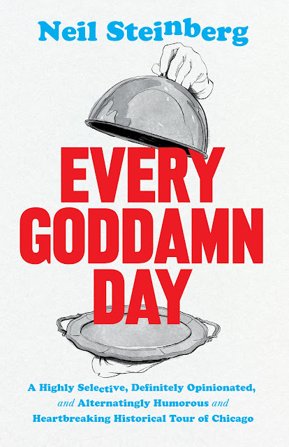
Now I'm back, good to go and onto the next task, today's post. Let's, ah, umm, share the cover of the book whose copy I have just picked over like an obsessive mother ape going after ticks on her child. For the past six weeks. Seeing the cover of a new book is always a moment of excitement and anxiety. It's like seeing your new face, designed by a stranger. This is my ninth book, and some covers I loved on sight, some hated. This one, I liked it when I first saw it, and like even more now.
Although when I first saw it, I did have a nagging qualm. I liked it; but I didn't love it, in the sense that what I wanted was a gorgeous Barry Butler photo—I already had one picked out, and helpfully sent to the Press—something that would shimmer like a gem on the shelves at the book shops at the Art Institute and the Chicago Architecture Foundation the way "You Were Never in Chicago" has done for a decade.
This was bold. But not shimmering. I'm proud of my response, applying one of my superpowers to the situation, the realization that it isn't all about me. People smarter than myself in the art of selling books chose this route. So I didn't complain. Didn't ask or changes. What I did say is, if I've learned anything, it's that the purpose of a book cover is not to tickle the aesthetic sensibilities of the author, but to catch the attention of readers, to draw them in, and this cover will look fantastic on your phone, shrunk to a half inch tall.
 |
I remember looking at this and
thinking, "Could you MAKE it
any smaller?" |
That was my initial take. Love builds over time, and now that a month or two has passed since I first saw it, I do kinda love the thing. Take a look at it and figure out why. Well, there is the artwork of Lauren Nassef, a Chicago artist and illustrator, who did a masterful job illustrating the book, and was a pleasure to work with (the "Whatever Happened to Baby Jane" domed silver server illustrates the Chicago Jewish community's famous, to me anyway, "dinnerless dinner" at the Drake in 1921, to benefit the needy in Europe. It was smartly repurposed to give the sense of presenting the city of Chicago, on a platter). I like the colors, the big bold block letters of "EVERY GODDAMN DAY," the way the server cover just hooks the top corner of the Y. And the way the gloved hand nudges my name up. Okay, I'll say it: I like my name being so big, splayed across the whole cover, and not the tiny type other books have used. Maybe they didn't get the memo from the Humility Department. The cover, I should point out, was designed by Isaac Tobin (who happens to be married to Lauren Nassef. Small world).
Does it work? Well, you can pre-order the book from the University of Chicago Press (it costs the same as on Amazon, and you aren't underwriting the Leviathan). There's a value to that beyond merely displaying enthusiasm. One way the University of Chicago Press stays in business is by not ordering up vast print runs. My last book, "Out of the Wreck I Rise" kept selling out, especially after Scott Simon interviewed me on National Public Radio. So when it was published, sometimes people would have to wait for weeks while the presses ground out more copies and barefoot children sitting cross-legged in drafty warehouses in Malaysia sewed the bindings (kidding; I believe they use machines now). Although to be honest, I'm not hanging fire on sales. First, it's my ninth book, so I'm familiar with the range of the possible. They always do well, or wellish, or well enough that I get to write another one, which is my main goal. And second, I learned so much doing this one, it was so much fun exploring the wide sweep of Chicago history, blowing dust out of the crannies and taking a peek inside, that I've already had my success. "You don't even have to publish the thing," I told my editor, turning it in. It was worth doing even if I were the only one to read it.
That said, I'm glad it's coming out—Oct. 21, for those of you who want to mark it on your calendars (what? You haven't ordered yet? Order it! Please). And I do hope you read it, because, well, it's got a lot in it. I'm glad they gave the book such a kick ass cover. Because despite the old saying, you can judge a book by its cover. People do it all the time.


